
データサイエンティストの必須知識、「母集団の推定方法 | 統計学の基礎」について解説します。
標本から母集団を推定する主な手法
母平均・母分散の点推定
母平均の点推定の方法
点推定は、母集団の特性を一つの数値で表現する方法です。母平均の点推定は、サンプルの平均値を用いて行います。具体的には、サンプルデータを使用して算出される平均値(サンプル平均)が、母平均の推定値となります。
数式で表すと以下のようになります。
\[
\mu_{\text{est}} = \bar{X} = \frac{1}{n} \sum_{i=1}^{n} X_i
\]
ここで、
- \( \mu_{\text{est}} \) は母平均の推定値
- \( \bar{X} \) はサンプル平均
- \( X_i \) はi番目のサンプルデータ
- \( n \) はサンプルサイズ
サンプルデータの分布をヒストグラムで表示し、サンプル平均を縦線で示す
# Import necessary libraries
import numpy as np
import matplotlib.pyplot as plt

# Generate sample data (For example, data from a normal distribution)
np.random.seed(0)
sample_data = np.random.normal(50, 10, 100)  # Mean=50, Standard Deviation=10, 100 data points

# Calculate the sample mean
sample_mean = np.mean(sample_data)

# Plot the histogram of the sample data
plt.figure(figsize=(10, 6))
plt.hist(sample_data, bins=20, alpha=0.7, label='Sample Data', color='blue')

# Draw a vertical line indicating the sample mean
plt.axvline(sample_mean, color='red', linestyle='dashed', linewidth=1, label=f'Sample Mean: {sample_mean:.2f}')

# Set graph labels and title
plt.legend()
plt.title('Histogram with Sample Mean')
plt.xlabel('Value')
plt.ylabel('Frequency')

# Display the graph
plt.show()
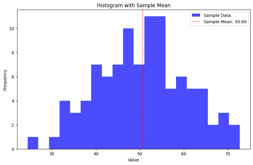
上記のコードは、サンプルデータとして平均50、標準偏差10の正規分布からランダムに生成された100点のデータを使用しています。
母分散の点推定の方法
母分散の点推定も、サンプルから算出される統計量を使用します。具体的には、サンプルの分散が母分散の推定値となります。
数式で表すと以下のようになります。
\[
\sigma^2_{\text{est}} = s^2 = \frac{1}{n-1} \sum_{i=1}^{n} (X_i – \bar{X})^2
\]
ここで、
- \( \sigma^2_{\text{est}} \) は母分散の推定値
- \( s^2 \) はサンプルの不偏分散
- \( X_i \) はi番目のサンプルデータ
- \( \bar{X} \) はサンプル平均
- \( n \) はサンプルサイズ
サンプルデータの分散や標準偏差を示すための箱ひげ図
# Import necessary libraries
import numpy as np
import matplotlib.pyplot as plt

# Generate sample data (For example, data from a normal distribution)
np.random.seed(0)
sample_data = np.random.normal(50, 10, 100)  # Mean=50, Standard Deviation=10, 100 data points

# Calculate the sample variance and standard deviation
sample_variance = np.var(sample_data, ddof=1)  # Using ddof=1 for unbiased estimate
sample_std = np.std(sample_data, ddof=1)  # Using ddof=1 for unbiased estimate

# Display the sample variance and standard deviation
print(f"Sample Variance: {sample_variance:.2f}")
print(f"Sample Standard Deviation: {sample_std:.2f}")

# Plot the boxplot of the sample data
plt.figure(figsize=(10, 6))
plt.boxplot(sample_data, vert=False)
plt.title('Boxplot of Sample Data')
plt.xlabel('Value')

# Display the graph
plt.show()
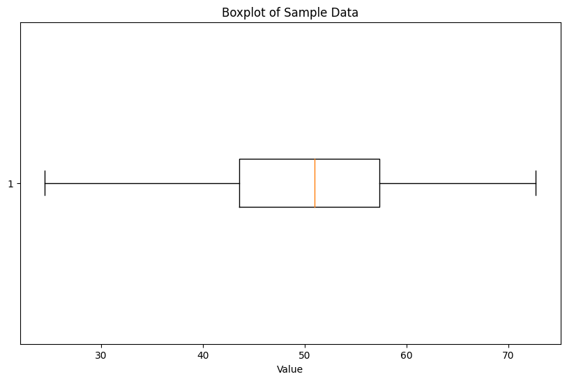
上記のコードは、サンプルデータとして平均50、標準偏差10の正規分布からランダムに生成された100点のデータを使用しています。箱ひげ図を使用して、データの分散や標準偏差、四分位範囲などの要約統計量を視覚的に示しています。
点推定の特性と意義
点推定の主な特性としては、一つの値で母集団の特性を表現することが挙げられます。しかし、それが真の値である保証はありません。点推定の意義は、データを簡潔に表現し、初歩的な情報を提供することにあります。
例えば、ある製品の顧客評価スコアの平均を知りたい場合、サンプルデータを元に点推定を行うことで、製品の平均的な評価を知ることができます。しかし、この推定値がどれだけ信頼できるか、また真の値とどれだけの誤差があるかを知るには、区間推定を行う必要があります。
母平均の区間推定
信頼係数と信頼区間
信頼係数の定義
信頼係数は、母集団の特性(例:平均)をある確率で含む区間の幅を示す指標です。一般的には、95%や99%など高い確率で用いられることが多いです。例えば、95%の信頼係数を持つ信頼区間は、真の母平均がその区間内に含まれる確率が95%であることを意味します。
信頼区間の計算方法
信頼区間は、点推定値を中心として、その上下にある幅を加えることで算出されます。この幅は、標準誤差と呼ばれる値と、z値やt値(信頼係数に基づく値)の積として得られます。
母分散が既知の場合:
\[
\text{信頼区間} = \bar{X} \pm z \times \frac{\sigma}{\sqrt{n}}
\]
母分散が未知の場合:
\[
\text{信頼区間} = \bar{X} \pm t \times \frac{s}{\sqrt{n}}
\]
ここで、
- \( \bar{X} \) はサンプル平均
- \( \sigma \) は母集団の標準偏差
- \( s \) はサンプルの標準偏差
- \( n \) はサンプルサイズ
- \( z \) はz値(母分散が既知の場合に使用)
- \( t \) はt値(母分散が未知の場合に使用)
信頼区間を示すためのエラーバーを持つグラフと、信頼区間を色で塗りつぶしたエリアプロットを作成しましょう。
# Import necessary libraries
import numpy as np
import matplotlib.pyplot as plt
import scipy.stats as stats

# Generate sample data (For example, data from a normal distribution)
np.random.seed(0)
sample_data = np.random.normal(50, 10, 100)  # Mean=50, Standard Deviation=10, 100 data points

# Calculate the sample mean and standard deviation
sample_mean = np.mean(sample_data)
sample_std = np.std(sample_data, ddof=1)  # Using ddof=1 for unbiased estimate

# Set the desired confidence level
alpha = 0.05  # for 95% confidence level
z_value = stats.norm.ppf(1 - alpha/2)

# Calculate the margin of error and the confidence interval
margin_of_error = z_value * (sample_std/np.sqrt(len(sample_data)))
confidence_interval = (sample_mean - margin_of_error, sample_mean + margin_of_error)

# Plot the graph with error bars and filled area indicating the confidence interval
plt.figure(figsize=(10, 6))

# Plot the sample mean with error bars indicating the confidence interval
plt.errorbar(1, sample_mean, yerr=margin_of_error, fmt='o', label='Sample Mean with 95% CI', color='blue')

# Fill the area between the confidence interval boundaries
plt.fill_between([0.5, 1.5], confidence_interval[0], confidence_interval[1], color='yellow', alpha=0.5, label='95% Confidence Interval')

# Set graph labels, title, and display settings
plt.ylim(sample_mean - 3*margin_of_error, sample_mean + 3*margin_of_error)
plt.xlim(0.5, 1.5)
plt.title('Sample Mean with 95% Confidence Interval')
plt.xticks([])
plt.legend()
plt.show()
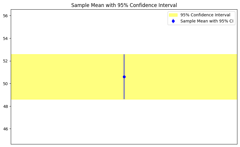
このコードは、サンプルデータの平均を中心とした95%の信頼区間を表示しています。信頼区間は、エラーバーと黄色の塗りつぶしで示されています。
例題:
ある商品の顧客満足度を調査した結果、100人のサンプルから平均値が85、標準偏差が10が得られました。このデータを基に、95%の信頼水準での母平均の信頼区間を求めてください。
import scipy.stats as stats

# Given data
mean = 85
std_dev = 10
n = 100
alpha = 0.05  # for 95% confidence level

# Calculate t-value
t_value = stats.t.ppf(1 - alpha/2, df=n-1)

# Calculate the confidence interval
lower_bound = mean - t_value * (std_dev / (n**0.5))
upper_bound = mean + t_value * (std_dev / (n**0.5))

lower_bound, upper_bound
(83.01578304849131, 86.98421695150869)
このPythonコードを実行すると、95%の信頼水準での母平均の信頼区間が得られます。
母分散が既知の場合の区間推定
母分散が既知の場合、母平均の区間推定はz分布を使用して計算されます。この方法は、標準誤差とz値を用いて信頼区間を求めるものです。
標準誤差の計算
標準誤差(Standard Error, SE)は、サンプル平均の分散を示す指標です。母分散が既知の場合、標準誤差は以下の式で計算されます。
\[
SE = \frac{\sigma}{\sqrt{n}}
\]
ここで、
- \( \sigma \) は母集団の標準偏差
- \( n \) はサンプルサイズ
z値を用いた信頼区間の計算
母平均の信頼区間は、サンプル平均を中心に、標準誤差とz値の積を上下に加えることで計算されます。具体的には以下の式を使用します。
\[
\text{信頼区間} = \bar{X} \pm z \times SE
\]
ここで、
- \( \bar{X} \) はサンプル平均
- \( z \) はz値(信頼係数に基づく値)
標準正規分布をプロットし、z値に基づく95%の信頼区間を黄色でハイライト表示してみましょう。
# Import necessary libraries
import numpy as np
import matplotlib.pyplot as plt
import scipy.stats as stats

# Generate sample data (For example, data from a normal distribution)
np.random.seed(0)
sample_data = np.random.normal(50, 10, 100)  # Mean=50, Standard Deviation=10, 100 data points

# For this example, let's assume the population variance is known and equals the variance of our sample
population_variance = np.var(sample_data)

# Set the desired confidence level
alpha = 0.05  # for 95% confidence level
z_value = stats.norm.ppf(1 - alpha/2)

# Plot the standard normal distribution
x = np.linspace(-3, 3, 1000)
y = stats.norm.pdf(x)

plt.figure(figsize=(10, 6))
plt.plot(x, y, label='Standard Normal Distribution', color='blue')

# Highlight the area under the curve within the z-value range
x_fill = np.linspace(-z_value, z_value, 1000)
y_fill = stats.norm.pdf(x_fill)
plt.fill_between(x_fill, y_fill, color='yellow', alpha=0.5, label=f'95% Confidence Interval (-z to z)')

# Set graph labels, title, and display settings
plt.title('Standard Normal Distribution with 95% Confidence Interval')
plt.xlabel('Z-value')
plt.ylabel('Probability Density')
plt.legend()
plt.show()
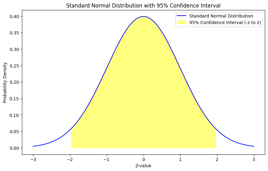
このコードは、標準正規分布をプロットし、z値に基づく95%の信頼区間を黄色でハイライトしています。
例題:
ある製品の顧客評価スコアを調査した結果、100人のサンプルから平均スコアが85が得られました。母集団の標準偏差が既知で、15であるとします。このデータを基に、95%の信頼水準での母平均の信頼区間を求めてください。
import scipy.stats as stats

# Given data
mean = 85
sigma = 15  # Population standard deviation
n = 100
alpha = 0.05  # for 95% confidence level

# Calculate z-value for 95% confidence level
z_value = stats.norm.ppf(1 - alpha/2)

# Calculate the standard error
SE = sigma / (n**0.5)

# Calculate the confidence interval
lower_bound = mean - z_value * SE
upper_bound = mean + z_value * SE

lower_bound, upper_bound
(82.06005402318992, 87.93994597681008)
このPythonコードを実行すると、95%の信頼水準での母平均の信頼区間が得られます。この信頼区間は、母集団の真の平均がこの区間内に存在する確率が95%であることを示しています。
母分散が未知の場合の区間推定
母分散が未知の場合、母平均の区間推定はt分布を使用して計算されます。この方法は、標準誤差とt値を用いて信頼区間を求めるものです。
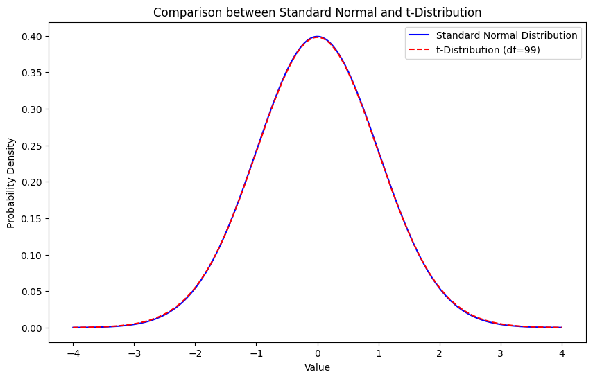
t分布の概要
t分布は、標準正規分布に似た形状を持つが、尾部がやや太い分布です。サンプルサイズが小さい場合や母分散が未知の場合に、母平均の区間推定に使用されます。サンプルサイズが大きくなると、t分布は標準正規分布に近づきます。
t分布の特徴:
- 平均0、分散が1より大きい(サンプルサイズに依存)
- 自由度(サンプルサイズ – 1)によって形状が変わる
- サンプルサイズが大きくなると、標準正規分布に近づく
t分布のグラフをプロットし、標準正規分布と比較して形状の違いを視覚的に確認してみましょう。
# Import necessary libraries
import numpy as np
import matplotlib.pyplot as plt
import scipy.stats as stats

# Generate sample data (For example, data from a normal distribution)
np.random.seed(0)
sample_data = np.random.normal(50, 10, 100)  # Mean=50, Standard Deviation=10, 100 data points

# Degrees of freedom for the t-distribution
df = len(sample_data) - 1

# Plot the t-distribution and the standard normal distribution
x = np.linspace(-4, 4, 1000)

# Calculate the PDFs
y_norm = stats.norm.pdf(x)
y_t = stats.t.pdf(x, df)

plt.figure(figsize=(10, 6))
plt.plot(x, y_norm, label='Standard Normal Distribution', color='blue')
plt.plot(x, y_t, label=f't-Distribution (df={df})', color='red', linestyle='--')

# Set graph labels, title, and display settings
plt.title('Comparison between Standard Normal and t-Distribution')
plt.xlabel('Value')
plt.ylabel('Probability Density')
plt.legend()
plt.show()
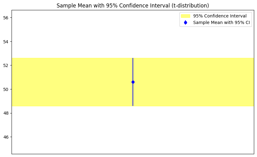
t値を用いた信頼区間の計算
母平均の信頼区間は、サンプル平均を中心に、標準誤差とt値の積を上下に加えることで計算されます。具体的には以下の式を使用します。
\[
\text{信頼区間} = \bar{X} \pm t \times SE
\]
ここで、
- \( \bar{X} \) はサンプル平均
- \( t \) はt値(信頼係数と自由度に基づく値)
- \( SE \) は標準誤差
t分布に基づく信頼区間を示すためのエリアプロットとエラーバーを持つグラフを作成できます。
# Import necessary libraries
import numpy as np
import matplotlib.pyplot as plt
import scipy.stats as stats# Calculate the sample mean and standard deviation

# Generate sample data (For example, data from a normal distribution)
np.random.seed(0)
sample_data = np.random.normal(50, 10, 100)  # Mean=50, Standard Deviation=10, 100 data points

sample_mean = np.mean(sample_data)
sample_std = np.std(sample_data, ddof=1)  # Using ddof=1 for unbiased estimate

# Set the desired confidence level
alpha = 0.05  # for 95% confidence level
t_value = stats.t.ppf(1 - alpha/2, df)

# Calculate the margin of error and the confidence interval
margin_of_error = t_value * (sample_std/np.sqrt(len(sample_data)))
confidence_interval = (sample_mean - margin_of_error, sample_mean + margin_of_error)

# Plot the graph with error bars and filled area indicating the confidence interval
plt.figure(figsize=(10, 6))

# Plot the sample mean with error bars indicating the confidence interval
plt.errorbar(1, sample_mean, yerr=margin_of_error, fmt='o', label='Sample Mean with 95% CI', color='blue')

# Fill the area between the confidence interval boundaries
plt.fill_between([0.5, 1.5], confidence_interval[0], confidence_interval[1], color='yellow', alpha=0.5, label='95% Confidence Interval')

# Set graph labels, title, and display settings
plt.ylim(sample_mean - 3*margin_of_error, sample_mean + 3*margin_of_error)
plt.xlim(0.5, 1.5)
plt.title('Sample Mean with 95% Confidence Interval (t-distribution)')
plt.xticks([])
plt.legend()
plt.show()
例題:
ある製品の顧客評価スコアを調査した結果、25人のサンプルから平均スコアが85、サンプルの標準偏差が10が得られました。このデータを基に、95%の信頼水準での母平均の信頼区間を求めてください。
import scipy.stats as stats

# Given data
mean = 85
s = 10  # Sample standard deviation
n = 25
alpha = 0.05  # for 95% confidence level

# Calculate t-value for 95% confidence level
t_value = stats.t.ppf(1 - alpha/2, df=n-1)

# Calculate the standard error
SE = s / (n**0.5)

# Calculate the confidence interval
lower_bound = mean - t_value * SE
upper_bound = mean + t_value * SE

lower_bound, upper_bound
(80.87220287674396, 89.12779712325604)
このPythonコードを実行すると、95%の信頼水準での母平均の信頼区間が得られます。この信頼区間は、母集団の真の平均がこの区間内に存在する確率が95%であることを示しています。
母分散の区間推定
母分散の区間推定は、サンプルデータの分散を基に、母分散が存在する可能性のある範囲を推定する方法です。
χ^2(カイ二乗)分布を用いた区間推定
母分散の区間推定には、χ^2分布を使用します。χ^2分布は、非負の値のみをとる右に裾の長い分布で、自由度によってその形状が決まります。
母分散の信頼区間は以下の式で計算されます。
\[
\left( \frac{(n-1) s^2}{\chi^2_{\alpha/2, n-1}}, \frac{(n-1) s^2}{\chi^2_{1-\alpha/2, n-1}} \right)
\]
ここで、
- \( n \) はサンプルサイズ
- \( s^2 \) はサンプルの不偏分散
- \( \chi^2_{\alpha/2, n-1} \) は自由度\( n-1 \)のχ^2分布の上側α/2点のχ^2値
- \( \chi^2_{1-\alpha/2, n-1} \) は自由度\( n-1 \)のχ^2分布の下側α/2点のχ^2値
χ^2(カイ二乗)分布のグラフをプロットし、信頼区間に基づく領域をハイライト表示してみましょう。
# Import necessary libraries
import numpy as np
import matplotlib.pyplot as plt
import scipy.stats as stats

# Generate sample data (For example, data from a normal distribution)
np.random.seed(0)
sample_data = np.random.normal(50, 10, 100)  # Mean=50, Standard Deviation=10, 100 data points

# Degrees of freedom for the chi-squared distribution
df = len(sample_data) - 1

# Calculate the sample variance
sample_variance = np.var(sample_data, ddof=1)  # Using ddof=1 for unbiased estimate

# Set the desired confidence level
alpha = 0.05  # for 95% confidence level

# Calculate the chi-squared values for the confidence interval boundaries
chi2_lower = stats.chi2.ppf(alpha / 2, df)
chi2_upper = stats.chi2.ppf(1 - alpha / 2, df)

# Calculate the confidence interval for the variance
variance_lower = (df * sample_variance) / chi2_upper
variance_upper = (df * sample_variance) / chi2_lower

# Plot the chi-squared distribution
x = np.linspace(0, df*2, 1000)
y = stats.chi2.pdf(x, df)

plt.figure(figsize=(10, 6))
plt.plot(x, y, label=f'\(\chi^2\)-Distribution (df={df})', color='blue')

# Highlight the area under the curve within the chi-squared values range
x_fill = np.linspace(0, chi2_upper, 1000)
y_fill = stats.chi2.pdf(x_fill, df)
plt.fill_between(x_fill, y_fill, color='yellow', alpha=0.5)

x_fill2 = np.linspace(chi2_lower, df*2, 1000)
y_fill2 = stats.chi2.pdf(x_fill2, df)
plt.fill_between(x_fill2, y_fill2, color='yellow', alpha=0.5, label='95% Confidence Interval')

# Set graph labels, title, and display settings
plt.title('\(\chi^2\)-Distribution with 95% Confidence Interval for Variance')
plt.xlabel('Value')
plt.ylabel('Probability Density')
plt.legend()
plt.show()
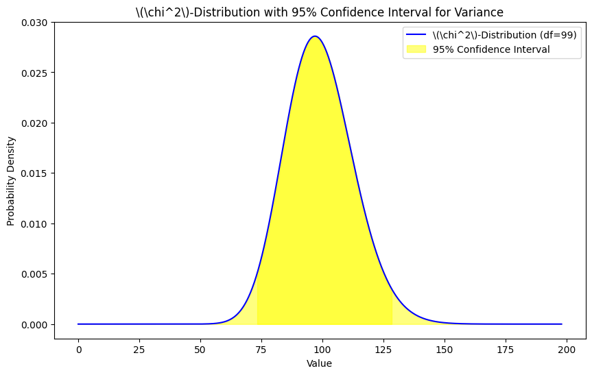
このコードは、サンプルデータの分散のための\(\chi^2\)分布を基にした95%の信頼区間を表示しています。信頼区間は、黄色でハイライトされた領域として示されています。
不偏分散を使用した区間推定の方法
母分散の推定にはサンプルの不偏分散を使用します。不偏分散は、サンプルの平均値を用いて各データのばらつきを計算したもので、以下の式で定義されます。
\[
s^2 = \frac{1}{n-1} \sum_{i=1}^{n} (X_i – \bar{X})^2
\]
信頼区間の計算方法と解釈
信頼区間は、真の母分散がその範囲内に存在する確率が、例えば95%や99%といった信頼水準であることを示す範囲です。信頼区間が狭ければ狭いほど、推定の精度が高いと言えます。
例題:
ある製品の顧客評価スコアを調査した結果、15人のサンプルから不偏分散が50が得られました。このデータを基に、95%の信頼水準での母分散の信頼区間を求めてください。
import scipy.stats as stats

# Given data
n = 15
s2 = 50  # Sample variance
alpha = 0.05  # for 95% confidence level

# Calculate chi-squared values for 95% confidence level
chi2_upper = stats.chi2.ppf(1 - alpha/2, df=n-1)
chi2_lower = stats.chi2.ppf(alpha/2, df=n-1)

# Calculate the confidence interval for variance
lower_bound = (n-1) * s2 / chi2_upper
upper_bound = (n-1) * s2 / chi2_lower

lower_bound, upper_bound
(26.800466802605428, 124.3620647346782)
このPythonコードを実行すると、95%の信頼水準での母分散の信頼区間が得られます。この信頼区間は、母集団の真の分散がこの区間内に存在する確率が95%であることを示しています。

▼IT人材は2030年に国内で79万人, 全世界で「8,500万人」以上不足!
▼世界の平均年収はなんと「1,000万円」以上!
▼自宅 + パソコン + 無料翻訳ツールで「全世界が仕事場!」
 AIエンジニア